
The animation that changed all
Published:
If you work on molecular epidemiology of viruses and have been following the Ebola virus epidemic in West Africa you probably encountered an animation that shows a phylogenetic reconstruction of virus migrations as a creeping and writhing swarm of lineages on a landscape gently shimmering with colours. If you have somehow been spared this is what I’m talking about:
The animation has had an excellent reception at conferences (and at least one kindergarten), has been used in lectures and for a number of months now could also legitimately be called award-winning. Some time ago I dedicated half an hour to nominate the animation for SciPy’s John Hunter Excellence in Plotting Contest, a yearly contest for the best open source matplotlib data visualisation and promptly forgot about it. I was reminded of it in July 2018 when Andrew Rambaut started tweeting congratulations because by some stroke of luck it got first place. Seeing as the animation has been awarded a prize I decided to write this blog post about how the animation came about, starting from its forerunners, how they shaped some of the design choices I made, and some of the coding challenges I encountered. Worst case scenario this is going to be me bragging about it, best case scenario this might actually generate some discussion about people’s aesthetic preferences and how to best visualise these sorts of data.
A short history of phylogeographic animations
Static phylogenies on their own are a remarkably terrible data visualisation and almost all of it comes down to the loss of one of the visualisation axes (the one along which the tips fan out). This immediately complicates the interpretation of the data where things that are happening simultaneously on a tree along the temporal axis might be entirely unrelated along the “fanning” axis. This is the exact issue that phylogeographic animations are excellent at solving, where the tree is transformed into cartographic space of a map and retains only the temporal axis. Unlike phylogenetic trees which require the esoteric knowledge of a phylogeneticist to interpret (and sometimes even that is insufficient), when the story encoded in a phylogeny unfolds on a map it is immediately relatable to the viewer, as long as the viewer has seen a map before.
There’s also an undeniable “wow” factor scientific videos/animations especially if they’re done well, they show something cool, and you’re not mucking about with PowerPoint trying to get it to play (with sound, no less). My first encounter with animated phylogeographic data was in 2009, when a pretty famous animation prepared (partly manually) in Google Earth by Philippe Lemey and Andrew Rambaut came out. It showed how the 2009 swine-origin H1N1 influenza virus pandemic spread across the globe:
Seeing a phylogeny, an object that usually looks dead as a doornail unless you’re a phylogeneticist yourself, with life breathed into it (literally animated) was quite fresh to begin with. But it had great artistic direction too - the lines representing lineages spread like tendrils across the planet, the planet rotated to follow the most recent spread at just the right time and speed, it was super slick. The quality and quantity of swine-origin H1N1 sequence data made it the ideal candidate for many future efforts at both analysis and data visualisation. The next memorable phylogeographic animation I encountered was Sam Lycett’s animation of the swine-origin 2009 H1N1 virus evolution post-pandemic across continents that wowed everyone at PopGroup in Glasgow and won Sam the prize for best talk.
I loved both animations when I saw them, but I could never shake the feeling that if it were up to me to produce an animation of a phylogeny in space and time I would do things a bit differently. When Trevor Bedford joined Andrew Rambaut’s lab he showed me a framework created by Michael Landis called Phylowood which came very close to what I’d consider ideal. Previous examples tended to be a bit jerky and low resolution because they were rendered in their time (and that time was a decade ago), which javascript took care of in Michael Landis’ animation. Michael Landis also went an extra step that others didn’t - he showed both the phylogeographic reconstruction on a map and the phylogeny that was its source simultaneously, linking the two in everyone’s mind. Some final details that were added, like colouring branches by their vertical position such that lineages diverging from each other would also diverge in colour were nice finishing touches and obviously the added interactivity was yet another cherry on top.
Even though I must have seen more phylogeographic animations during my PhD (especially once tools like Spread showed up) the three I just described have influenced me the most. What I’m trying to say is that there were a lot of colleagues who came before me and whose efforts provided some general direction, but also honed my aesthetics by not being perfect in my eyes. I guess the best we can hope for in the end is that someone else will look upon our work and be both sufficiently inspired and sufficiently unhappy to start from where we left off and produce something marvellous and unexpected out of it.
Design
Colours
When Andrew Rambaut and myself started working on the big Ebola paper one of the first things we decided to do was to standardise locations designations. A standardised colour scheme soon followed, based on Kristian Andersen’s suggestion (green Guinea, blue Sierra Leone, red Liberia) which was inspired by the national flags of each of the three countries. Green, blue and red were an excellent choice in retrospect - they’re distinct basic colours and incidentally all three are available as standard colour maps within matplotlib. It didn’t take too long for problems to arise with the default matplotlib red, blue and green colour palettes though - within a couple of months we received an email from a collaborator saying they had difficulty distinguishing the colours we were using. That day was saved by colorbrewer and its selection of qualitative colours which were colour-blind safe and subtly different from commonly used colours, adding to the magic. Additional magic was added, like always, by desaturating the colours a tiny bit.
The next step was determining how to use the colour ramps to represent information. An obvious use was encoding total number of cases reported by each location/administrative area on a map.

This worked very well. Another use of the colour ramps was to generate unique colours for each administrative area in each country. It’s usually difficult to come up with more than 8 distinct colours for categorical data so we didn’t even try since Guinea alone had 27 prefectures reporting Ebola virus disease which had to be coloured on a map. There was still a design choice to be made, however.
Ideally the colour should still provide some information rather than induce headache via random assignment of colours to administrative divisions, and so I think most people would agree that representing their relative positions in space is as good a metric as any. In order to turn two-dimensional coordinates (population centroids of each administrative division) into a colour one could take something like the index of a given location’s longitude among a given country’s locations. It’s simple and can be effective, but is questionable if countries have a lot of population centroids along one or the other axis, resulting in poor ability to distinguish areas or adjacent areas having discontinuous colours. At one point I remembered a conversation I had with Darren Obbard a long time ago about this exact problem. If you have a set of coordinates and want to find the axis along which the coordinates will be the most distant from each other all you have to do is find their first principle component. After that it’s up to you how you use it - as a location’s index along PCA1 or some normalised measure. You can see the results of this in one of the supplementary figures and judge for yourself.
Map design
Plotting administrative division polygons in matplotlib, despite being a building-a-house-out-of-hammers kind of plotting exercise, was actually pretty straightforward. I got to grips with shapefiles and geoJSONs relatively quickly and with a good grasp of matplotlib basics dealing with polygons was no different from any other plotting in matplotlib. What became a personal design problem were the borders between countries. Even though the countries were distinguishable because of different colour ramps I wanted to add that extra bit of information to the map that would make it look even more legit - the international borders.

I bet you didn’t even notice that the previous map also contained a highlighted international border. Although emphasising the international border was unnecessary because the countries already had distinct colours I think non-intrusive additions to the plot, no matter how trivial or redundant, go a long way to making a good plot even better (but that’s personal). Finding the international border, as unnecessary as it was, unfortunately took days to solve, because, as it turned out, coordinates for the administrative areas within countries were made by different people. Coordinates shared by administrative polygons of different countries (i.e. the international border) differed by a few millimetres, small enough not to be visible in plotted maps, but large enough that automating the extraction of the international border was made unreasonably difficult. The solution to this problem ended up being a combination of finding better polygons and code to do an exhaustive and inefficient search for polygon coordinates in different countries smaller than some threshold. These days I try to get polygons that share coordinates and use python’s set objects to speed up the process of finding shared coordinates between polygons.
Tree design
The first iteration of the animation never had a phylogenetic tree, just the map. If you think about it the whole point of phylogeographic animations is to avoid showing any phylogenies. As I mentioned earlier molecular phylogenies are inherently terrible for data visualisation:
- The y-axis in molecular phylogenetics emphasises separation of lineages and nothing else, losing an entire axis for visualisation, but using the axis for anything else is usually guaranteed to result in a messy visualisation. Unless you’re lucky with the metric of choice.
- Extracting information from a phylogeny often involves darting around the entire figure more than a few times, e.g. when looking at where lineages came from or how they are related.
- Events that are simultaneous on a phylogeny (in the case of temporal phylogenies) are not shown as such because they are offset along the y-axis.
And yet despite a typical phylogeny being completely incomprehensible to the layperson, the one nice feature of phylogenies is that a phylogeny contains the entire history of the samples. My decision to include the phylogeny in the animation, in addition to showing the raw underlying data, hopefully also made the point to more casual viewers that a phylogeny is a complete historical record of the samples.
When the tree was included I went through several iterations of animating it. At first I went with the simplest and most disappointing option - a full tree coloured by inferred location (using the PCA-based colour scheme described before) with a line sweeping through it to indicate the current time point in the animation. Since the tree was visible and unchanging at all times there was little reason for the audience to ever consult the tree past the initial peek. I decided to introduce a bit of suspense by colouring the entire phylogeny in shades of grey and having the line that marked the current time point uncover their true colours as it passed (essentially what was done for the case counts in the final version). Even that felt like spoiling it, hence the final decision to make the phylogeny entirely unknown up to the current time point. This made the phylogeny more true to life in that anything that was happening on the map was a retrospective look at what happened already, not something to consult about what will happen. I hope the more casual observer got the same impression.
Migration design
Perhaps the most iconic element of the animation has been the “missiles” (a term coined by Andrew Rambaut), traveling lines that were chosen to visualise migrations on the map. Migrations visualised as straight lines were obviously never an option, since they look dull and obscure each other if migrations are simultaneous, close to each other or traveling at each other. The lines had to look organic, which is not the easiest to implement mathematically (for someone with my non-maths training), so my initial thought was to use segments of a circle with a varying radius. I can’t remember if I had seen SpreaD3 by then, which I believe uses the same idea. The code I was toying with at the time was probably derived from some previous circular things I’ve plotted for my influenza B virus reassortment study:

I quickly gave up on plotting segments of circles, partly because it was consuming more time than I was comfortable with, for an end result that I didn’t particularly enjoy anyway. The very same figure gave me another idea though. Segments of a circle were plotted using my code, but the lines indicating linkage disequilibrium between influenza B virus segments were drawn in matplotlib using Paths, which can draw Bézier curves.
Bézier curves, much like other maths-y concepts, have a quirky history, in this case involving the French automobile industry, where they were used to design cars for Renault (who employed Pierre Bézier) and Citroën. It’s easy to see why they’re popular - given a starting point, an end point and any number of ordered “control points” the algorithm draws a line going from point A to point B that is tugged along the way towards control points. Even more conveniently Bézier curves will usually be implemented to take two parameters that determine which fraction of the path to compute coordinates for, simplifying things even further.

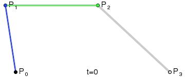
At that point the design decision was made, but actual implementation remained problematic. I had code to do Bézier curves, but I didn’t have code to generate control points where I wanted them. Ideally the control point for each migration in the simplest case would be a point perpendicular to the centre of the imaginary line connecting locations A and B, some arbitrary and customisable distance away. This turned into a trigonometry exercise beyond my abilities, but not those of my PhD brother Luiz Max de Carvalho. It took him minutes to land a piece of paper on my desk with the formula I required, which given coordinates for locations A and B and some distance d would give you the coordinates of a point distance d away from, and perpendicular to, the centre of the line AB. The function was even asymmetric, such that the target point landed on one or the other side of the line, depending on whether you wanted to go A to B or B to A. This allowed migration missiles to never overlap when migrations were symmetric and simultaneous as well as having desired curvature, so that long range migrations were nearly straight lines and adjacent locations were connected via exaggerated (but most importantly visible!) arcs.
Unlike previous phylogeographic animations I had seen I was determined that mine would not display the history of migrations in a cumulative way either. This might confuse some readers, so I invite you to compare these two Zika virus animations on nextstrain: cumulative and non-cumulative. Basically, cumulative means that once you’ve shown a migration happening its path remains in view for the rest of the animation, rather than showing lineages that exist at the current time point and only some small part of their immediate past. In the past when datasets were small with relatively few migration events visualising cumulative histories may have filled up the screen in non-intrusive and informative ways (e.g. the H1N1 2009 pandemic animations), but these days there’s usually enough data to make overlapping the past with the present (when plotting histories in a cumulative way) exceedingly confusing.
Coding challenges
The time to develop a visualisation in matplotlib is inversely proportional to how fast it can be rendered. The usual plot-adjust-replot cycle is severely disrupted when it takes too long to see the figure after changing the code because obviously you can’t help but go check on other open tabs in your browser. Animations are basically that, but times a thousand, and there’s rarely an alternative, since it’s a large volume of figures spliced together. One of the first things that was clearly going to be a major obstacle was the sheer volume of polygons that needed plotting. Even when doing a static map all the polygons would take two or three seconds to render, which does not extrapolate well to thousands of frames. The solution to that problem was pretty straightforward - plot the polygons once and alter them frame to frame, which matplotlib made relatively easy. A lot of time saving during the rendering process was achieved by not touching certain elements of the animation with a label that indicated they were done. Speeding up the rest of development was just animating short segments of the timeline when not much was going on and doing fewer polygons until the aesthetics were honed.
The earliest versions of the animation that looked close to being finished were never made public because they were at ridiculously low resolution. All prototyping that happened initially was done with matplotlib’s native animation module which works great for simple animations, but quickly runs into issues with more objects. Memory issues surfaced first. Leaving the native module rendering overnight often crashed if Bézier’s were plotted with too many points, too many frames were being interpolated between epidemiological weeks or dots per inch were set too high. And even if rendering video didn’t crash when it was left running overnight then the resulting video would have compression artefacts that made the animation unusable, unless the resolution was turned down to potato. Both of these problems indicated that the buffer was being overwhelmed pretty fast. The animation that people use and love these days looks so crisp because of thousands of frames that were saved as ultra-high quality PNGs in a folder and then stitched together in FFmpeg.
Implementations
There’s currently two implementations of the overall animation design - one from the Ebola paper GitHub repo which ends up being so complicatedly interwoven that it’s practically impossible for anyone to reproduce without every single tiny file we ended up using, and a generalised version called curonia as part of baltic. The latter is the only bit of code I recommend consulting if you want to make your phylogeographic animation, since it’s the same code but fully exposed, stripped down to its bare essentials with streamlined functions and a dedicated library for computing Béziers just in case you want to go nuts with migration lines.